|
We hope you enjoy reading how best to engage site visitors and improve conversion ratios (i.e. booking rates & perusal of timetables etc.) in a tourism product website. Get a coffee, sit back, and take your time with this detailed analysis by User Experience Designer Marcus Deacey. |

User experience is underpinned by basic needs
Let’s start with the basic synergy that exist between the railway and the tourist.
WCWR are focussed on receiving qualified website users: ergo users that have a high propensity to book
- To engage those users (to peruse experience options)
- To convert those users (to book or to subscribe)
New users have never seen the website, but have an awareness through word of mouth or other mixed offline/online media and therefore have a limited understanding of the unique value proposition.
- To find out or confirm if this is suitable for me, my guests, or my family, and if I like it : to book.
Return users have been convinced by the unique value proposition and are ready to convert straight away.
- Book tickets
What does the data say?
Obviously, we can’t reveal the real analytics for confidentiality reasons.
So let’s suppose the following for the sake of this UX demo
How to convert the visitors into customers
impress me… in 8 seconds (user needs above the fold)
Critique of the current experience (above the fold)
Let’s assume the role of the 35-year old ticket-buying mother; imagine how she feels.
Banner blindness and concealed emotional hook
Hidden social persuasion
Difficult usability
Imagery disconnected from primary offering
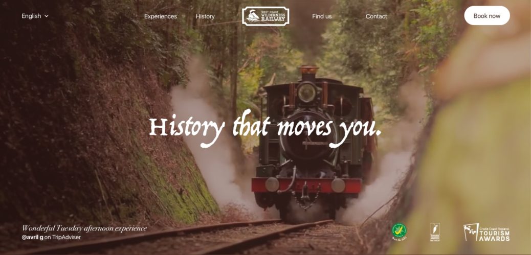
Arriving on the West Coast Wilderness Railway homepage she orients herself to the layout in order to decide which information to zero in on.
Her first impression is banner blindness from the strong, page-dominant revolving-content slider. Nonetheless, the alternating text headlines, bold image and colour changes steal her attention and she begins her focus.
The headlines are small and difficult to read over the banner images. She views the first slide and gasps at how beautiful the experience is on the West Coast. Beyond that, the black-on-grey description below feels disconnected and boring compared to the imagery above; thus not overly compelled to scroll down.
There is no obvious social proof above the fold that other people have enjoyed the experience.
Perhaps if other people with families had previously enjoyed the experience, her family would too. Or maybe they’ve found something better…
Continuing to focus, she finds it difficult to realise what is a button or navigation item and what isn’t… the odd button shapes feel disconnected from each other and the page. Instead of looking like a button, the booking button feels more like a sign or sticker.
She notices an offer in the rotating banner that looks interesting. She wants to read more about it. And just as she gathers the motivation to click through and learn more, she notices that she can’t. There’s no call-to-action ‘read more’ button on the slide. Now the rotator switches to another slide that doesn’t have any relevance to her, and the content is whisked away before she could fully take it in. This removes any sense of emotional connection.
What happens now? She’s confronted with another slide and now has to decide whether to focus on reading it or to go back to the previous. She’s frustrated and disoriented. And now the banner rotates again.
She decided that she really wants to view that first slide. The one that caught her attention; the one that drove the initial emotional reaction. But now that the banner has rotated multiple times, she doesn’t know how to get back to it. She has to figure out the usability of this gallery. She tries to locate the tiny row of dots hidden among the bold, colourful photos in the offer. She clicks through them, one-by-one to try and find the first offer.
At this point, she’s distracted, frustrated and confused. She wants to leave the site but instead continues to scroll down the page, away from that banner.
Now that she has scrolled down, she has missed half of the other slides. Content has been ignored. Now she is unsure if the page under the fold describes a certain slide in more detail. She has lost her sense of place. Nevertheless, she begins to read the text below. The small description adds somewhat to her understanding of the experience. Attention-grabbing phrases like ‘spectacular’, ‘steep grades of the rack and pinion’, ‘renowned for’ and ‘sit back in comfort’ encourage her to learn more. But at the same time, she’s getting tired of reading.
The three journeys are the primary offering and core selling point but do not seem to be the primary focus of the environment. The text and grey background do not seem lively and bright – but instead bland compared to the bright images above. Our 35yo mums attention is directed at the wrong component.
Our redesign nails the needs above the fold
Once again, let’s assume the role of our 35-year old ticket-buying mother...
But what happens beneath the fold?
If our user is interested they’ll become rational and start validating that emotional intent.
Consider the following complex and multi-dimensional needs:
- “How much do I have to pay for this?”
- “What’s the price compared to something equally as good?”
- “Is there a twin or family discount?”
- “Are certain days or times of the year better?”
- “When is the best time of the year to go?”
- “Does it take the entire day or only a few hours?”
- “What time does it start?”
- “What time does it finish?”
- “Can we get there in time?”
- “What do other people think?”
- “Was it what they expected?”
- ”Did they pay too much?”
- “Which bits did they like most?
- What should I be most keen for?
- Which bits didn’t they like?”
- “Do I need to stay for multiple days?”
- “Do I need to book accommodation?”
- “Where do I book accommodation?”
- “Will it be cold?”
- “How do I dress?”
- “Do I need to bring jackets for my family?”
- “What do I need to wear to be more prepared?”
- “Is food included or do I need to bring it?”
- “Where can I get food? Is it at the station or nearby?”
- “Is there food on the train?”
- “How many food options are there at the station?”
- “Does the food offered suit my dietary requirements? Can I ask?”
- “Are there toilets on the train?”
- “Are there toilets at the station? Will the train leave without me if I go to the toilet?”
- “How often do we get off?”
- “Can I wait anywhere?”
- “What else is there to do nearby?”
- “How many days should I spend here?”
If all needs are satisfied, users may become hooked.
At this stage they’ll be thinking:
- “Which carriage do I get?”
- “Which suits me the most?”
- “What are the differences between carriages?”
- “Do different carriages have different time options?”
- “Are they different prices?”
- “Do they have different food or drink options?”
- “Do I book here or ring up?”
- “How long in advance do I have to book?”
- “Does it only run on certain days or times of the year?”
The current experience fails to quickly address mental blockers below the fold
...again, let's imagine how our 35yo mum feels, now that she’s beginning to rationalise.
It’s likely that she will not notice that the separate journeys have different advantages and disadvantages. However, it is obvious that the default tab (Rack & Gorge) has food included but only with purchasing the more expensive carriage. Therefore, she assumes that she must bring food for herself and her family if she was going on the budget carriage.
Let’s imagine our persona is in Tasmania for a few days. She wants to compare the West Coast Wilderness Railway to other attractions on the West Coast of Tasmania, by value and by price. A quick Google in a separate tab would allow her to compare attractions but would remove her from the environment.
She assumes that Tracks Cafe (Queenstown station) is the only food option outside of the carriage. This assumption would be wrong. There is also an option for food at Rinadeena cafe (depending on the trip), although this piece of information is hidden under the ‘stations’ tab and is incredibly easy to miss.
She does not know if she should book accommodation alongside the journey in order to stay for multiple days, or if she should. She may be more enticed to go to or spend a longer period of time in the West Coast of Tasmania if other activities were possible. In order to realise this possibility, she must use a new tab – removing her from the environment.
It’s not possible to plan other activities for the same day, as the exact starting and finishing times of each journey are not shown.
There is no mention of weather or the temperature within the carriages. She doesn’t know what her family should wear in order to dress comfortably. There is no mention of toilets, stopovers, or wait periods.
She may feel more trusting towards the West Coast Wilderness Railway after viewing the awards they’ve won. However, testimonials from similar people would be much more attractive.
The pricing structure is not prominent on the page. Our persona may be confused as to the difference in offerings between carriages, which would likely cause her to review all points of rationalisation. It may also cause our persona to think that within the pricing structure there is something to hide. The combination of these points is likely to be a blocker to quick conversion.
Whilst prices are shown, it is not immediately obvious that each journey is priced differently. Each separate journey must be viewed independently in order to compare prices for single adult, single children or for a family. A second comparison must be made to consider carriage offerings compared to price.
A booking button leads our 35yo mum to a new online booking environment. She is able to view the days in which bookings are available. She can select any day in the future, but data is only shown for up to 6 months in the future. However, it’s obvious that the online booking environment is the easiest way to book.
Our redesigned experience (below the fold) blows away all decision making barriers.
Don’t forget to make it super easy for the returning-user
A much shorter path occurs for returning users. As they’ve previously read the unique propositions, they’re back to either double check information or book a ticket.
They will have very specific use cases:
- “How do I easily find the single piece of information I’m looking for?”
- “How do I go immediately to booking?”
The current design gives an effective route to conversion – although the booking button does not look like a button (aforementioned). The redesign uses this same user flow but the button now stands out, contrasted against the video background, above all, and unmistakably a button.
Weather icons created by Titusurya – Freepik.com


